
There has been an increased interest in the research and study on color psychology in marketing and branding. Think of the last item that you bought from a brand. Can you still recall the logo’s color? There is a big chance that you still do and maybe you can clearly remember it more than the item’s price itself.
Gone are the days when color theory, palettes, and paint buckets are just meant for those in field of arts. Now more than ever, everyone involved in marketing should learn and understand the basics. This is the reason why it is important that you know about the psychology of color and its positive and negative effects on your marketing efforts.
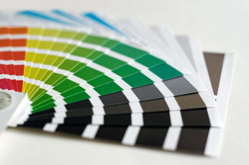
What is Color Psychology?
Color psychology is simply the study of colors. To be more specific, this is the study of how specific colors, hues, shades, and tints affect people and their feelings or emotions. Simply put, this is the study of the way colors can make you feel. This is now a growing inspection that is getting more and more useful and helpful in the field of marketing, design, and branding.
This is a study or aspect of how the human brain can perceive what it visualized. Once the brain sees a particular color, how is this color translated all over the body? What type of impact does this color has on the person’s thoughts, ideas, actions, and emotions?
It is exactly what color psychology hopes to dissect and understand
You might not realize it but color plays a crucial role in the way you act. Colors make you feel and think in different ways. As a consumer, color psychology in marketing has a unique way of urging some actions such as buying products, signing up for promotions, and choosing specific brands instead of others in general.
Every color has its very own personality before it stirs up a certain emotion from you. This is the realization that experts in color psychology have realized. Colors have their own persona which can also affect your own in turn. Each color can elicit a certain emotion from viewers.
This is not a hard science, as expected, but some studies back up these claims. It has been proven that colors really affect the way products and brands and the choice of color in branding as a whole relies a lot on color appropriateness.
It means that color matters and this is not a secret to consumers even if this is only on subconscious level.
However, what are the personalities of each color and what emotions do they evoke in consumers?
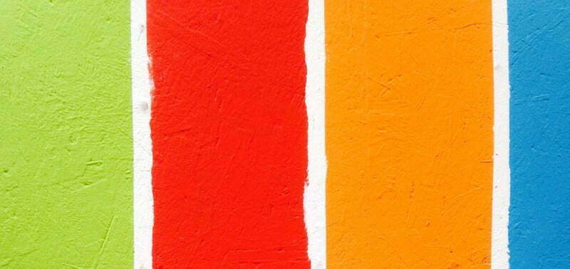
Take a look at the following basic colors and the specific emotions that they evoke:
Black
Black is a contrasting and powerful color used for selling upscale and sleek products. Sophistication, substance, elegance, authority, security, and power are the positive emotions that it evokes while the negative emotions are depression, oppression, mourning, heaviness, and coldness. Some brands that use the timeless color are L’Oréal, Nespresso, The New York Times, and Nike.
Blue
Tranquility, security, serenity, logic, loyalty, and trust are the positive emotions of blue while negative ones are unfriendly, unappetizing, coldness, and emotionless. Blue can calm the mind and is often used in Feng Shui and interior design. This is the color used by brands that manage sensitive and personal information such as LinkedIn and American Express.
Brown
Brown is depicted as a natural and earthy color usually seen in food packaging that indicates eco-friendly, natural, and organic food. Its positive emotions include sophistication, safety, security, strength, and reliability. Isolation, sadness, and loneliness are some of the negative emotions associated with it. Hershey’s, J.P. Morgan Chase, and UPS are the brands that use brown in their logos, uniforms, and ads.
Green
Green is a color that is easy on the eyes and symbolized the natural world and life. This is strongly associated with power and wealth such as the economy, military, and banking. Its positive emotions include harmony, balance, growth, health, nature, prosperity, and hope while the negative emotions are materialism, envy, boredom, and possessiveness. This is often used for environment-focused companies and health brands like Animal Planet, Whole Foods, and John Deere.
Gold
Gold is linked with positive emotions including success, compassion, wisdom, optimism, and charisma. The negative emotions associated with gold are vile, demanding, and self-centered. This color implies wealth in most cultures across the world and is usually linked with religion and royalty. Gold is also the color representing first place in competing events like sports. High-end companies such as Porsche, Versace, and Rolex use gold in their products and logo.
Magenta or Pink
Magenta or pink is the color that is most often used for depicting youth and femininity. This is also associated with comfort and hope. Pink is linked with positive emotions like passion, quirkiness, creativity, and innovation. Sauciness, rebelliousness, impulsiveness, and extravagance are the negative emotions that magenta evokes. Victoria’s Secret, Cosmopolitan magazine, and Barbie are the famous brands that use magenta.
Orange
Orange generates cozy and warm feelings. The positive emotions it evokes include friendliness, confidence, cheerfulness, energy, innovation, warmth, courage, and vitality. The negative emotions associated with it are laziness, immaturity, ignorance, and frustration. Some sports team mascots use orange as this exudes energy and motivation.
Purple
Wealth, imaginative, mysticism, sophistication, spirituality, and wisdom are some of the positive emotions linked with purple. The negative emotions are pain, danger, unfriendliness, aggression, and hostility. This is usually used in luxury brands and royalty for positioning themselves as prestigious. Purple is used in ads and logos by confectionary brands such as Milka and Cadbury.
Red
Red is a color that creates some sense of urgency and is also linked with movement like blood pressure and heart rate. Power, excitement, passion, fearlessness, and energy are the positive emotions that this color stirs up while the negative ones include pain, danger, hostility, aggression, unfriendliness.
By familiarizing yourself with the color of psychology in marketing, you can fully harness the power of colors and use it to your advantage.